
The opportunity
People save hundreds of recipes. They cook almost none of them.
Saving takes one tap; cooking from those saves doesn’t. And most weeknight meals are repeats: people rotate around twenty trusted dishes. Recipe apps optimise for discovery. The underserved job is cooking again.
Job to be done: when I’m deciding what to cook tonight, I want a dish I know works, with what I have, so I can start without thinking.
User journey
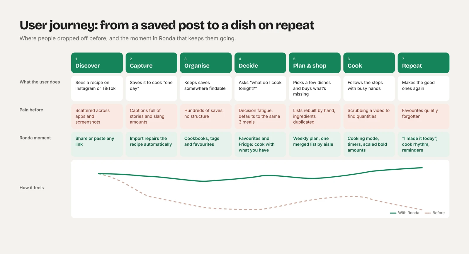
I mapped the path from a saved post to a dish on repeat. Drop-off happens at three points: capture (messy captions), decide (decision fatigue) and repeat (favourites forgotten). Ronda is designed around those moments.
Product strategy
A retention product, not a discovery one. Ronda means a round in Spanish, and the product is one loop:
- SaveAny link or a photo, cleaned into a usable recipe.
- PlanA light weekly plan and one merged shopping list.
- Cook and logHands-free cooking mode; “I made it today”.
- ResurfaceCook counts and rhythm bring favourites back.
North-star metric: recipes cooked per active user per week. Saves alone are a vanity metric.
Key decisions
Navigation by frequency of use
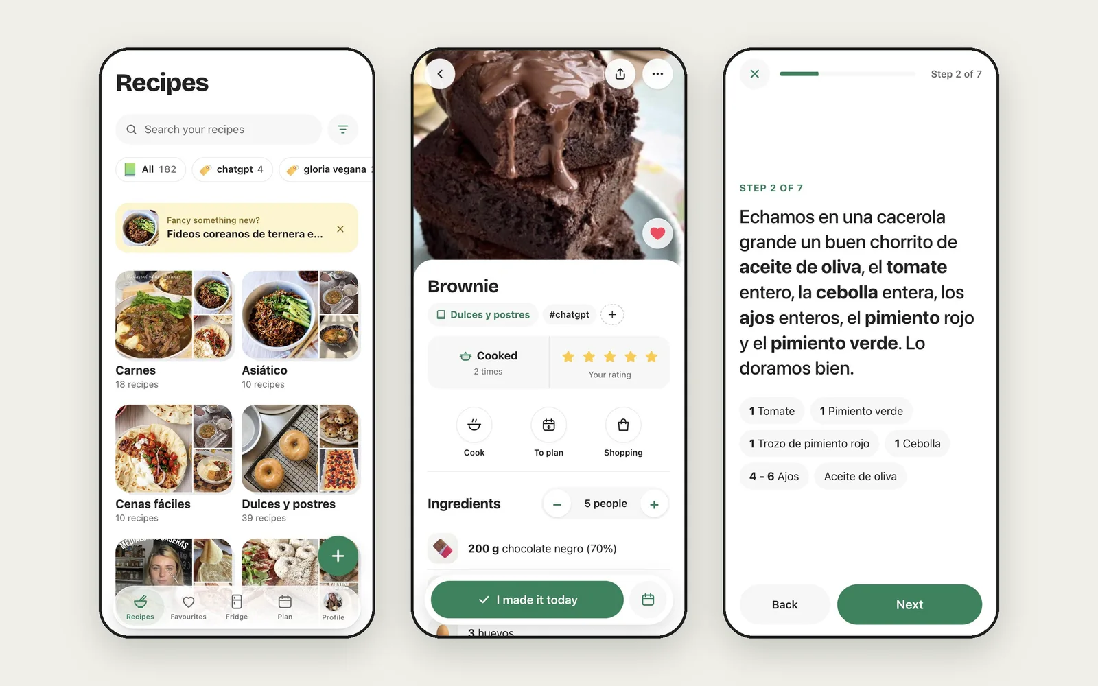
Cooking a favourite is the most frequent task, so Favourites got a tab; the weekly shopping list moved inside Plan.
Fridge: start from what you have
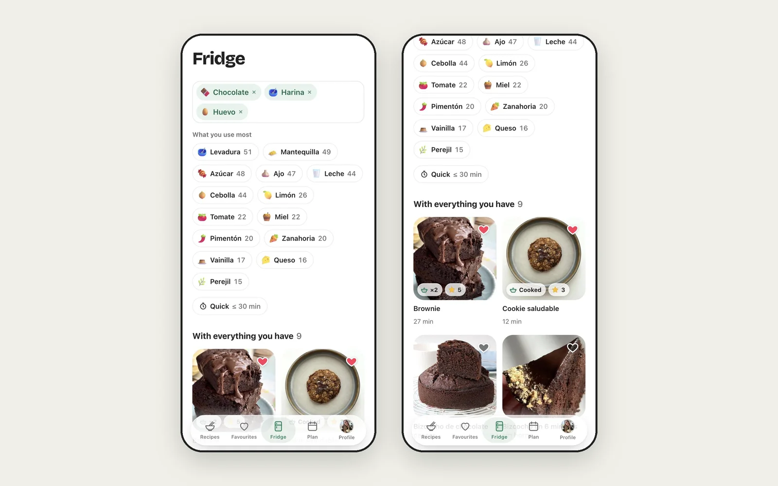
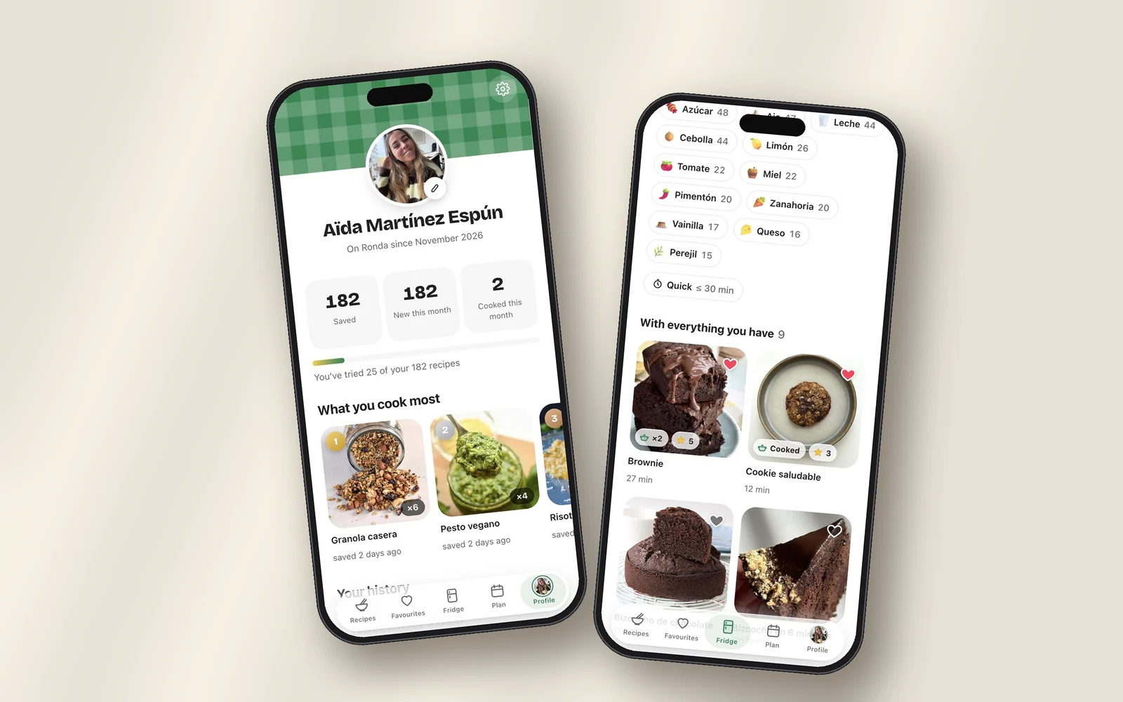
Pick ingredients, see recipes with everything you have, then those missing one thing. A strict filter returned almost nothing; partial matches always give a next step.
Activation depends on import quality
The first imported recipe is the activation moment. A repair pipeline cleans every import and fixed 110 of 295 recipes in a real collection.
Growth and retention
- No empty first runNew accounts start with example recipes, already rated and cooked.
- Re-engagementA weekly planning reminder at the time each user picks.
- Built-in distributionShared recipe links open without an account and invite a save.
- Low frictionA PWA: no app store, four languages, phone and desktop.
Next: instrument activation, weekly retention and referral conversion.
The product
- CaptureInstagram, TikTok, YouTube and web imports, photo scan, dictation.
- OrganiseCookbooks, tags, favourites, bulk actions, 30-day bin.
- CookScaled bold amounts, ingredient icons, cooking mode with timers.
- Plan and shopWeekly plan, ideas due again, list grouped by aisle.
- ProfileCooking stats, what you cook most, monthly history.
- PlatformPush reminders, auto-translated recipes, full desktop layout.
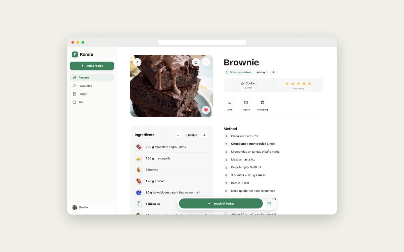
Desktop
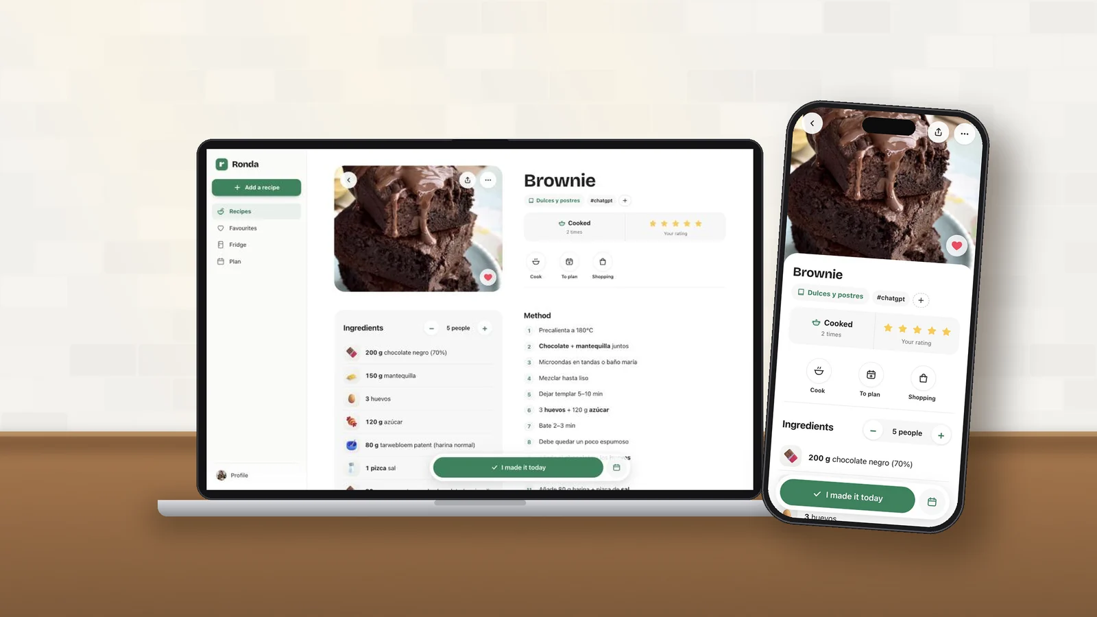
Planning often happens on a laptop. On large screens the tab bar becomes a sidebar, ingredients sit beside the method, and every gesture has a mouse and keyboard twin.
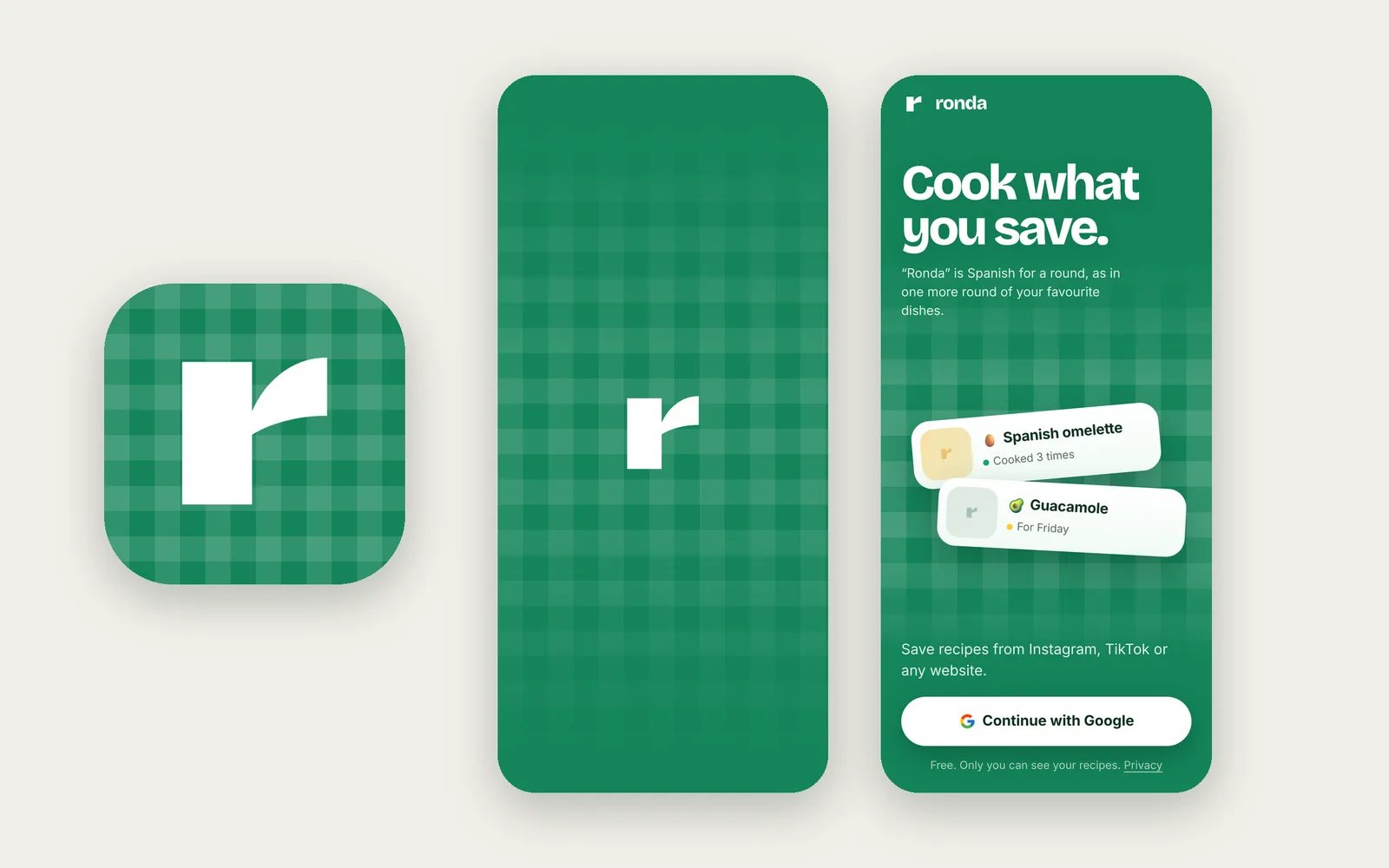
Brand
A green gingham tablecloth from icon to launch screen, and a single lowercase r in Syne, legible at 16 px.
Built solo with AI
One designer, no engineers. 100% of the code written by AI.
I owned strategy, UX, brand and every product decision; Claude did the engineering. I worked through skills, specialist instructions for each phase:
- UX: UX design reviewer and UX copywriter
- Brand: logo design and graphic design
- Interface: frontend design, UI quality and mobile-native PWA guidance
- Engineering: Next.js and Vercel best practices, Supabase
- QA: in-app browser testing at phone and desktop sizes, 89 automated tests
Every feature followed the same loop: brief, options, critique, build, test on device, ship, live within minutes. My time went into judgement: prioritising, reviewing and saying no.
What’s next
Shared cookbooks: send a whole cookbook as a link, turning the sharing loop into an acquisition channel, then validate the north-star metric before monetisation.